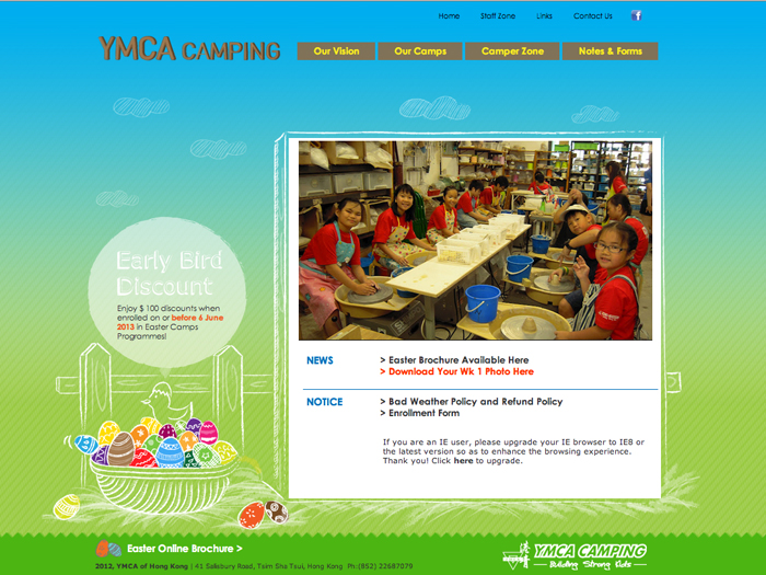
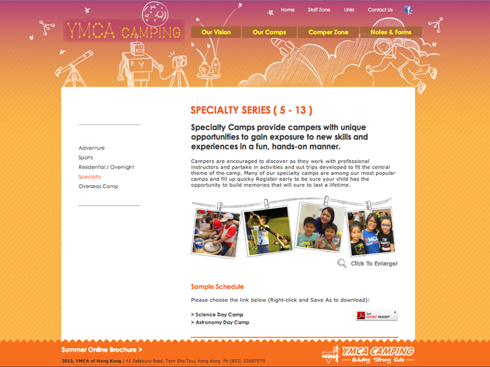
This is my work during the internship in Hong Kong YMCA camping office. I was responsible for designing and building the website for the camping office.
The targets of the camping activities are the kids and parents so the tone of the website is approached to be childish. Chalk- like lines on the background are used to compose the scenes of the camping activities. I want to make the website look relaxing, funny but not serious.
http://www.ymcahk.org.hk/camping/


