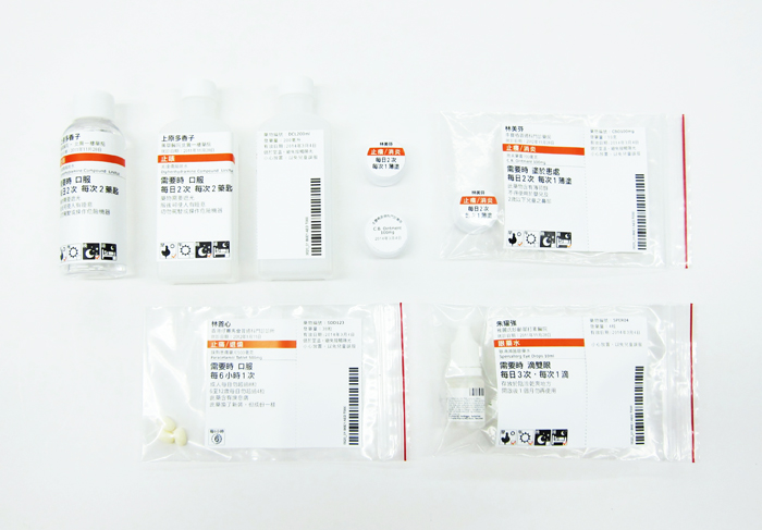
This is a group project about re- designing the medicine label of local public hospitals. In fact, there is a number of elder people who have difficulties in reading the information of the existing medicine label. Therefore, we have studied about the behaviour of the elderly on reading the label, the routine of taking medicine and the reading ability of the information. Finally, we propose to do a splittable label to separate the most important information for users and other information for the medical staff. Pictograms are proposed in the lable for the elderly who cannot read texts well. The orange color is used to highlight the function of the medicine so as to remind the users to take the medicine correctly. Based on the importance of information (resulted by card sorting), we have used different font sizes and weights to present the information hierarchy.

